Our desk looks like a crime scene. Coffee rings overlap like Olympic symbols, sticky notes multiply faster than rabbits, and somewhere under this creative chaos is my keyboard. But hey, that’s where the magic happens! And speaking of magic, let’s talk about turning your website visitors into actual paying customers. ✨
We’ve all been there. Pouring our hearts into a beautiful website only to hear crickets instead of conversion bells. Frustrating, right?
But here’s the thing. Converting visitors isn’t about fancy bells and whistles. It’s about strategic design elements that speak directly to your visitors’ needs and guide them toward taking action.
Let’s dive into five proven website design elements that actually work for real small businesses.
1. Hero Sections That Actually Connect
The hero section is prime real estate. It’s the first thing visitors see, and we have about 3 seconds to make an impression.
What works: Clear, benefit-focused headlines paired with authentic imagery.
Real examples: A family-owned plumbing business in San Jose, replaced their generic “Welcome to our website” headline with “Emergency Plumbing Repairs in 60 Minutes or Less—Guaranteed.” They added a simple photo of their actual team (not stock photos) standing next to their trucks.
Result? Their lead form submissions jumped 43% in the first month.
The magic here isn’t complicated. They addressed an immediate pain point (emergency repairs) with a specific promise (60 minutes) and showed the real humans who would show up at your door.
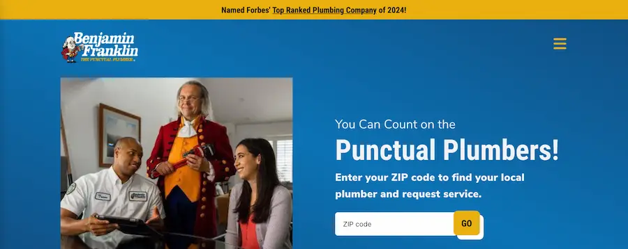
Big businesses follow a similar route. Benjamin Franklin Plumbing took the spotlight-stealing approach. They sweet-talked their way into Forbes magazine (humble brag much?) with their 4.5-star rating and convinced everyone they’re America’s plumbing royalty. Their service spans 33 cities, but here’s their real mic-drop moment: “If we’re late, your wallet gets fatter—$5 for every minute we keep you waiting, up to $300.” Talk about putting your money where your mouth is! Their phones haven’t stopped ringing since, and their booking rate jumped significantly after that guarantee went live. No wonder, they have an Ahrefs domain rank of 66. Nothing builds trust quite like a company willing to pay for their mistakes. 💰
We don’t need to be clever. We need to be clear about how we solve problems.
Elevate Your Digital Presence
Ready to transform your content strategy? Our expert team delivers SEO-optimized blogs and powerful backlink strategies that drive real results.
Boost Your Content Strategy →2. Social Proof That Feels Authentic
Nothing builds trust faster than seeing others like us who’ve already taken the leap.
What works: Strategic placement of testimonials near decision points, using real names, photos, and specific results.
Real example: A gluten-free bakery in Austin embedded short video testimonials from actual customers right next to their online ordering form. These weren’t polished productions—just 15-second smartphone videos of happy customers sharing what they loved.
Their online orders increased by 67% within two months.
Why did this work? Because potential customers could see real people enjoying the products at the exact moment they were deciding whether to order. The authenticity of smartphone videos actually worked better than professional testimonials because they felt more trustworthy.
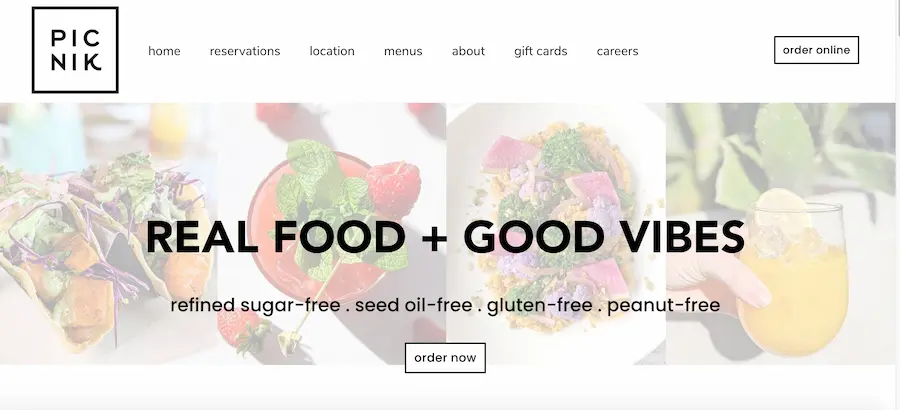
Here’s another example. Picnik restaurant’s knockout USP in Austin? They’ve ditched the junk (bye-bye refined sugar, seed oils, gluten, and peanuts) in favor of premium cold-pressed avocado oil and EVOO, crafting crave-worthy eats and drinks that welcome every diet tribe from vegan warriors to paleo purists—proof that “healthy” and “holy-cow-that’s-delicious” can totally share a plate. 🌱✨
3. Forms That Don’t Scare People Away
Forms are where conversions live or die. Too many fields, and people bounce faster than a rubber ball.
What works: Minimalist forms that ask only what’s absolutely necessary, with clear value propositions.
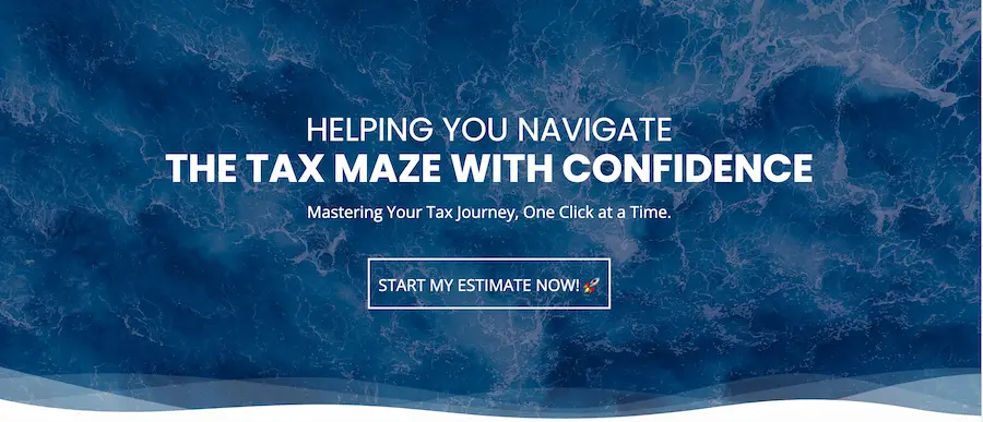
Real example: An accounting firm in Mountain View reduced their contact form from 9 fields to just 3 (name, email, and “What can we help with?”). They also added a simple line: “We’ll respond within 4 business hours with a free tax savings estimate.”
Their form completions increased by 126%, and their qualified leads improved because the open-ended question helped filter serious inquiries.
The lesson? Every field we add creates friction. Ask yourself: “Do we really need this information right now, or can we get it after establishing contact?”
4. Call-to-Action Buttons That Actually Get Clicked
Those little buttons carry a lot of weight in the conversion world.
What works: Action-oriented, benefit-focused button text in contrasting colors.
Real example: A landscaping firm changed their standard “Submit” button to “Get My Free Design Consultation” and made it a bright green that contrasted with their earthy color scheme. They also added a small line underneath: “No obligation, takes 15 minutes.”
Their click-through rate increased by 31%, and consultation bookings went up by 24%.
The specificity of “Get My Free Design Consultation” works because it tells visitors exactly what happens next. The supporting text addresses common objections (time commitment and pressure concerns) before they can become barriers.
Similarly, Black Diamond doesn’t just plant shrubs—they’ve been crafting drool-worthy outdoor sanctuaries across California since 2004, with a trophy case of certifications, awards, and over 3,500 five-star reviews that scream “we turn boring backyards into Instagram-worthy retreats” while promising 100% satisfaction (translation: they won’t bail until you’re doing happy dances around your new patio). 🌿

5. Mobile Experiences That Don’t Make People Want to Throw Their Phones
Over 60% of web traffic comes from mobile devices, yet so many small business websites still treat mobile as an afterthought.
What works: Thumb-friendly navigation, faster load times, and simplified content.
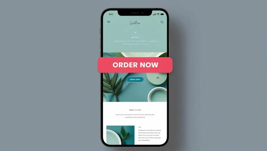
Real example: A local pet supply store in Arizona, rebuilt their mobile experience with a sticky “Order Now” button that follows users as they scroll. They also created a simplified mobile menu that prioritized their most-requested information: hours, location, and current deals.
Their mobile conversions increased by 82%, and their bounce rate dropped by 27%.
The key insight? They watched actual customers try to use their site on phones and fixed the pain points. Sometimes the best research doesn’t need fancy tools—just observation.
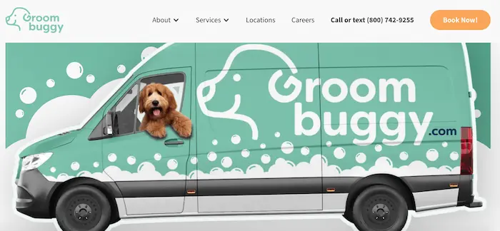
Similarly, Groom Buggy revolutionized the fur game with their “we come to you” mobile grooming studio that transforms anxious pooches into pampered princes right in your driveway—combining premium products and breed-specific tools with the ultimate convenience of never having to wrestle your reluctant Rover into the car again (goodbye 4-hour grooming marathons, hello Netflix time while Fido gets fabulous outside). 🐾
What These Small Businesses Got Right
Looking across these examples, a few patterns emerge:
- They focused on clarity over cleverness. Simple, direct language that addresses specific pain points converts better than creative wordplay.
- They reduced friction at every step. Fewer form fields, clear next steps, and addressing objections before they arise.
- They used real people and authentic content. Actual customers and team members outperformed stock photography and generic testimonials.
- They made small, measurable changes. None of these businesses redesigned their entire websites. They identified specific conversion points and improved them.
“We were skeptical about simplifying our contact form,” says Sarah, an accounting firm owner from Mountain View. “We thought we needed all that information upfront. But we realized we were creating barriers. Now we get more leads, and our conversations start from a much more positive place because we’re not forcing people through a questionnaire just to talk to us.”
How to Apply This to Your Website
Start small. Pick one of these elements and test it on your site:
- Rewrite your hero headline to focus on a specific benefit
- Add a real customer testimonial near your contact form
- Reduce your form fields to the bare minimum
- Change your button text to describe the specific next step
- Watch someone try to use your site on a mobile device and fix the frustrating parts
The beauty of these changes is that they don’t require a complete redesign or massive budget. Small, strategic improvements can dramatically impact your conversion rates.
We’ve seen businesses transform their results with these simple changes. Your website isn’t just a digital brochure—it’s your hardest-working salesperson. Give it the tools to succeed.
Jaw-dropping designs might win design awards, but they won’t win customers if visitors can’t figure out what the heck you’re selling in 3 seconds flat. The real conversion magic happens when you ditch the artistic ego trip and craft crystal-clear messaging that screams “THIS is how we solve your problem” – because at 2AM when someone’s desperately searching for an emergency plumber, they don’t care about your parallax scrolling effects or that fancy animation that took 40 hours to code. 🔥
Ready to turn more of your visitors into leads? Start with just one of these elements this week. Sometimes the smallest changes create the biggest results.
Not feeling the whole DIY website makeover thing? Shoot us a message and we’ll handle the conversion-boosting magic while you get back to what you actually enjoy doing (because let’s be real, you didn’t start a business to spend weekends tweaking button colors). 👩💻
FAQs
How do I design a website using a free website builder?
Designing a website with a free website builder is straightforward. First, choose a reputable platform like Wix, Squarespace, or WordPress. Then select a template that matches your vision, customize the layout, fonts, and colors to align with your brand. Add your content and any necessary graphic elements. Most free website builders offer drag and drop functionality, making it easy to arrange elements without coding knowledge. Before publishing, preview your site across different devices to ensure responsive web design. The best free website builders allow you to create a professional-looking site quickly, though premium features may require upgrading to a paid plan.
What are the essential elements of good web design that help a website stand out online?
Good web design combines several key elements to help you stand out online. First, focus on clean layout and intuitive navigation to enhance user experience design. Use consistent typography and a color scheme that reflects your brand identity. Incorporate high-quality images and graphic design elements that convey your message effectively. Ensure responsive web design so your site works perfectly across all devices. Optimize page loading speed, as slow sites lose visitors quickly. Implement proper white space to avoid cluttered pages. Finally, include clear calls-to-action that guide visitors toward conversion goals. Remember that the best websites balance aesthetic appeal with functional user interface design.
How important is responsive web design when creating a website?
Responsive web design is absolutely critical in today’s digital landscape. With mobile devices accounting for over 50% of global web traffic, your website must function flawlessly across smartphones, tablets, and desktops. A responsive design automatically adjusts layout, image sizes, and navigation elements based on screen size, ensuring optimal user experience regardless of device. This adaptability not only improves visitor satisfaction but also positively impacts your SEO rankings, as search engines prioritize mobile-friendly websites. Without responsive design, you risk alienating a significant portion of potential visitors who will quickly leave if they encounter a poorly-displayed site on their device.
What should I look for when choosing a website template for my business?
When selecting a website template for your business, prioritize designs that align with your industry and brand aesthetic. Look for customizable templates that allow you to adjust colors, fonts, and layouts to match your brand identity. Ensure the template is responsive and mobile-friendly. Consider your content needs—some templates excel at showcasing visuals for portfolios, while others optimize text for blogs or e-commerce functionality for online stores. Check that the template supports necessary integrations for tools you’ll need. Finally, read reviews and preview live examples of sites using that template to assess loading speed and overall user experience. The right template should require minimal customization while providing a solid foundation for your web design.
How can I optimize my website for SEO when using a website builder?
To optimize your website for SEO when using a website builder, start by researching relevant keywords for your industry and incorporating them naturally in your page titles, headings, and content. Ensure your website builder allows customization of meta descriptions and title tags for each page. Create quality, original content that addresses your audience’s needs. Optimize images by compressing them and adding descriptive alt text. Ensure your site has a logical structure with proper heading hierarchy (H1, H2, etc.). Most quality website builders offer built-in SEO tools—take advantage of these features to improve your site’s visibility. Finally, make sure your website loads quickly and is mobile-responsive, as these factors significantly impact search rankings.
What’s the difference between hiring a web designer and using a website builder?
Hiring a web designer offers personalized service and custom design tailored specifically to your brand and requirements. A professional web designer brings expertise in user experience design, interaction design, and can create unique visual identities through advanced CSS, JavaScript, and other coding languages. They typically deliver more original and distinctive websites with optimized performance. In contrast, website builders offer templates and drag-and-drop tools that make it affordable and quick to create a website yourself. While website builders have improved dramatically with customizable templates and professional-looking designs, they have limitations in uniqueness and functionality. Your choice depends on your budget, timeline, technical skills, and how custom you need your website to be.
What graphic elements should I include to create a professional website design?
For a professional website design, incorporate thoughtfully selected graphic elements that enhance rather than overwhelm your content. Start with a clean, high-resolution logo that reinforces your brand identity. Use consistent, high-quality images that relate directly to your content and optimize them for web to maintain fast loading times. Include meaningful icons to improve navigation and visual appeal. Consider subtle animations or micro-interactions to engage users without distracting them. Custom illustrations can help explain complex concepts and add personality. Maintain a cohesive color palette that reflects your brand throughout all graphic elements. Remember that white space is also a powerful design element—don’t overcrowd your pages. These graphic design components should work together to create a polished, professional appearance while supporting your content and improving user experience.
What are the best practices for creating a website that converts visitors?
To create a website that effectively converts visitors, follow these best practices: First, ensure your site loads quickly—each second of delay can significantly reduce conversions. Implement clean, intuitive navigation so users easily find what they’re looking for. Place clear calls-to-action prominently on each page, using contrasting colors and compelling text. Optimize your site for mobile users with responsive web design. Build trust with testimonials, reviews, security badges, and transparent policies. Use high-quality images and concise, benefit-focused copy that addresses your visitors’ needs. Simplify your forms by requesting only essential information. Create landing pages that match your advertising claims. Finally, constantly test different elements and analyze user behavior data to refine your approach—conversion optimization is an ongoing process.
Can I create a free website that looks professional for my business?
Yes, you can create a professional-looking free website for your business, though it comes with some limitations. Modern free website builders like Wix, WordPress.com, and Google Sites offer impressive customizable templates and design tools that can produce polished results. To maximize professionalism, choose a clean, industry-appropriate template, use high-quality images, maintain consistent branding, and ensure your content is well-written and error-free. However, free websites typically include builder branding, limited functionality, restricted storage, and domain names that include the platform’s name (yoursite.wixsite.com). For a fully professional presence, you may eventually need to upgrade to a paid plan for a custom domain, removal of platform branding, and advanced features. Still, starting with a free website is an excellent way to establish your online presence while testing what works before investing.
